Ricochet Business Solutions Course
Ricochet Business Solutions

How Websites Actually Work

A two week course for people who will never write code by hand

10Lessons
2Weeks
1 hrPer day
1Real site shipped

Read this first

What this is

This course exists because you can already get an AI to build you a website, and that is a real skill worth money. What you cannot do yet is tell whether what came back is good, know the words to ask for something better, or explain to a paying client why one version works and the other does not.

That gap is the whole course. You are not learning to code. You are learning to see, to name what you see, and to direct.

Ten lessons over two weeks, one a day on weekdays. Each one is about an hour: read it, look at the examples, do the assignment. By Friday of week two you will have built and shipped a complete website for a real business.

The reference site for the entire course is Picasso's Salon. It is real, it is live, and it was built the way you are about to learn. Open it in another tab and keep it there.

Week 1

Learning to see

Nobody can build something they cannot describe. Week one is vocabulary and eyes.

Week 2

Learning to ship

Week two is the client, the build, the launch, and getting paid.

The plan

Ten lessons

One a day, weekdays. Click any lesson to open it. Do them in order.

Before you start

Where to look

Every assignment in this course that says go find something also tells you exactly where to look. You should never be staring at a blank search box wondering where sites come from.

Two rules before you start. First, form your opinion privately. You are going to be selling to businesses in this town, and a screenshot of somebody's website under a heading about what cheap looks like is a bill that comes due later. Judge freely, publish nothing. Second, judging a site is not the same as judging the person who owns it. Most bad small business websites were made by somebody doing their best with a template at eleven at night.

Where the good ones live

Galleries where designers post work. Open one, scroll for ten minutes, and you will have seen more good design than most people see in a year.

  • AwwwardsAwarded sites, updated daily. Heavy on the spectacular. Good for seeing what is possible.
  • GodlyCurated, tighter, more restrained taste than Awwwards. Closer to what a real client would pay for.
  • One Page LoveSingle page sites only. The most useful of the three for you, because most of your clients need one page done well.

Four sites worth studying properly

Not for looking at once. For opening whenever you are stuck on a decision, because each one solves a different problem extremely well.

  • StripeThe reference for hierarchy and spacing. Notice how much empty space there is and how nothing feels crowded.
  • LinearOne accent color, a strict type scale, and almost nothing decorative. Restraint you can copy.
  • AppleEnormous type, one idea per screen, and photography treated as the whole design.
  • BasecampPlain, opinionated, and written like a person talks. Proof that a site does not need to be beautiful to be good.

Deliberately plain, and why that is allowed

These are famous and they are plain on purpose. Nobody is embarrassed by them, so you can pick them apart freely. Each one teaches something a pretty site cannot.

  • Berkshire HathawayA company worth close to a trillion dollars with a website from another era. Kept that way on purpose. Ask yourself who their customer is and whether design would help.
  • CraigslistAlmost no design at all and still one of the most used sites in America. Speed and familiarity beat beauty when people already know what they came for.
  • McMaster CarrThis is the important one. It looks dated and it is one of the best working websites ever built. Search something, anything, and watch how fast it is. Looking good and working well are two different skills and you need both.
  • Ling’s CarsDeliberately chaotic, wildly successful, and the owner is proud of it. Proof that rules exist to be understood before they are broken.

Raw material from real businesses

This is where the honest practice is. Small business sites across the whole quality range, and none of them are trying to win awards.

  • Google Maps, then the website buttonSearch a trade plus a small town: plumber Chase City VA, hvac Clarksville VA, roofing South Hill VA. Open the listing, click Website. Ten minutes gets you fifteen real sites.
  • The same search on Google itselfType the trade and the town. Skip the ads at the top. The results below are the real local market and the real competition.
  • Facebook business pagesSearch a trade and a town. Many small businesses have a Facebook page and no website at all. Those are prospects, not examples.

What the internet used to look like

For seeing how far things have moved without picking on anybody who is still trading.

  • The Wayback MachinePaste any big brand and pick a year around 2000 to 2008. Apple, Amazon, McDonald’s. Same companies, same money, completely different rules.

Week 1  •  Monday  •  Lesson 1 of 10

What a website actually is

Goal Understand what happens between somebody typing a name and a page appearing.

Words you need

Domain
The name people type. picassossalonsouthhill.com. You rent it, usually about fifteen dollars a year. You never own it forever.
Host
The computer somewhere in the world that holds your files and hands them out when somebody asks. Netlify is a host.
DNS
The phone book that connects the domain to the host. Changing DNS is how a domain starts pointing at a new site.
HTML
The file that holds the words and the structure. Headings, paragraphs, images, links. Think of it as the skeleton.
CSS
The file that holds every decision about how it looks. Colors, sizes, spacing, layout. Think of it as the skin and clothes.
JavaScript
The file that makes things happen when you click. Menus opening, forms responding. Think of it as the muscles.
Browser
Chrome, Safari, Firefox. It downloads those three kinds of file and draws the page on screen.
Deploy
Copying your folder onto the host so the world can see it. Also called shipping or publishing.

The lesson

A website is not a thing that lives on the internet. It is a folder of files sitting on somebody else's computer. When a person types a name, their browser asks the phone book where that name lives, goes to that computer, downloads the files, and draws them on screen. That is the entire mechanism.

This matters because it explains something you already ran into. A folder of website files only works when the whole folder travels together. The HTML file says go get the stylesheet from the css folder and go get the photos from the images folder. Separate them and the browser shows you words on a white page, because the skeleton arrived and nothing else did.

It also explains why a website is cheap to run. You are renting a name and renting a shelf to put files on. The work is in the files, not the hosting.

See it

Swipe to see all of it

BROWSER somebody types the domain DNS the phone book where does it live HOST the computer holding the folder THE PAGE drawn on screen ABOUT HALF A SECOND, START TO FINISH You rent the domain. You rent the host. You own the folder in the middle.
What actually happens when somebody types a business name.

Swipe to see all of it

index.html the skeleton, and the boss css / site.css every look decision skin and clothes js / site.js what happens on click muscles images / photos and the logo Separate them and the browser gets the skeleton and nothing else. That is the next picture.
A website is a folder. index.html is the boss and it asks for everything else.
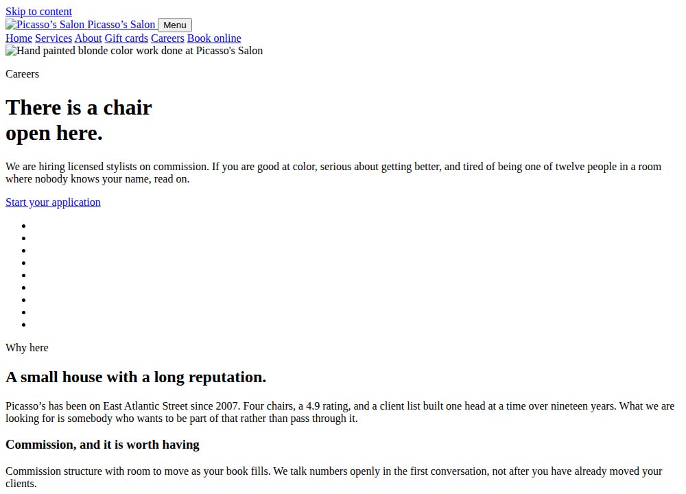
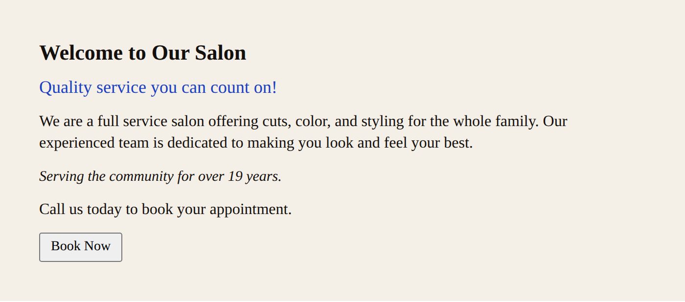
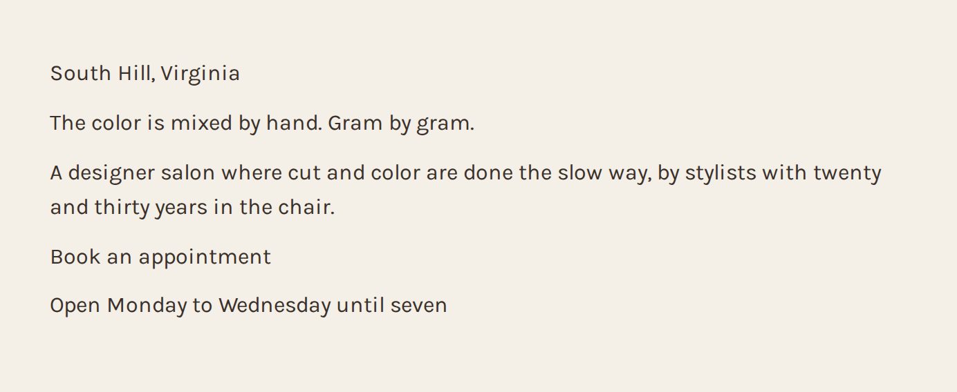
A web page rendered with no stylesheet, showing plain black Times New Roman text on white with blue underlined links
The exact same careers page you will see later in this course, with the stylesheet blocked. The skeleton arrived and nothing else did. This is what a website looks like with no CSS.

Go look

Open the reference site. Right click anywhere and choose View Page Source. That wall of text is the HTML file, the skeleton. Near the top you will see a line linking to css/site.css. That is the skeleton asking for its clothes.

Browser prompt: Find out what a site is built on

Open any business website, then paste this into the Claude Chrome extension. It reads the page and reports back. It changes nothing. Keep every one of these, because by lesson ten they add up to a complete audit you can run on a prospect before you ever call them.

Paste into the Chrome extension

You are on a business website. Read only. Do not click anything, do not fill anything in, do not sign in, change nothing.

Report back:
1. What the site appears to be built on. Look for WordPress, Wix, Squarespace, Shopify, GoDaddy, Duda, or hand written code. Say how you can tell.
2. If it is WordPress, the theme name if you can find it.
3. The copyright year in the footer, exactly as written.
4. Whether there is a web designer credited anywhere, and their name and link.
5. Every page in the top navigation, in order.
6. Whether the site has any way to book, buy, or submit a form, or whether the only action is a phone number.

Plain numbered list. If something is not there, say not there rather than guessing.

Read only. It will not click, submit, or sign in to anything.

Assignment

Start here

  1. Google Maps: search a trade plus a small town, then click Website on three listings.
  2. Or open any of the four study sites and view source there instead.

All the places to look

  1. Write down, in your own words with no jargon, what happens between somebody typing a business name and the page showing up. Five sentences maximum.
  2. Open three real local business websites using the Google Maps method below. For each one, write the domain, then guess who hosts it. You will not be able to tell yet. Guess anyway and write down why.
  3. Look at the source of one of them and find the line that links to its stylesheet.

Check yourself

Can you explain to somebody's parent why a website is a folder and not a thing? If not, read the first paragraph again.

Week 1  •  Tuesday  •  Lesson 2 of 10

The parts of a page and what they are called

Goal Learn the name of every region on a page so you can point at problems precisely.

Words you need

Hero
The first full screen a visitor sees. Usually a big image or color, a headline, a sentence, and a button. It has one job: make somebody stay.
Above the fold
Everything visible before scrolling. The phrase comes from newspapers, which were folded in half on the stand.
Nav
Short for navigation. The row of links across the top that goes to the other pages.
Header
The strip at the very top holding the logo and the nav. Sticky header means it stays put while you scroll.
Footer
The block at the very bottom. Address, phone, hours, links, copyright.
Section
One horizontal band of the page with one idea in it. A page is a stack of sections.
CTA
Call to action. The thing you want them to do, written as a command. Book an appointment. Get a quote.
Card
A small rectangle holding one item: one service, one person, one product. Cards usually come in rows of two, three or four.
Grid
The invisible column structure everything lines up to. Good sites line up. Bad sites almost line up.
Whitespace
Empty space. It is not wasted. It is the single biggest difference between an expensive looking site and a cheap one.
Above and below
Hierarchy. What your eye hits first, second, third. You control this with size, weight, color and space.

The lesson

Almost every business website on earth is the same stack of parts in a slightly different order. Header, hero, a few sections, footer. Once you can name the parts, a site stops being a wall of stuff and becomes a list of decisions somebody made.

The hero carries more weight than everything else combined. Most visitors decide whether to keep scrolling in about three seconds, and the hero is all they have seen. A hero needs exactly three things: what this is, why it is different, and what to do next. If a hero is missing one of those, that is a real defect and you can say so.

Sections should each carry one idea. The moment a section is trying to say two things, split it into two sections. Crowded sections are the most common reason a site feels amateur, and the fix is almost always to remove something rather than rearrange it.

See it

Swipe to see all of it

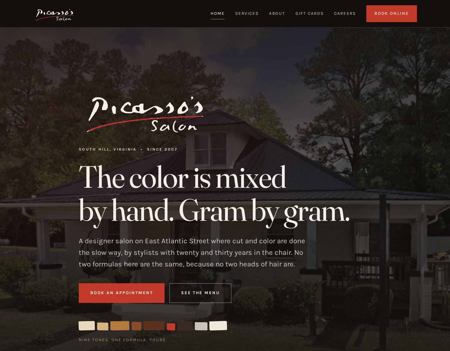
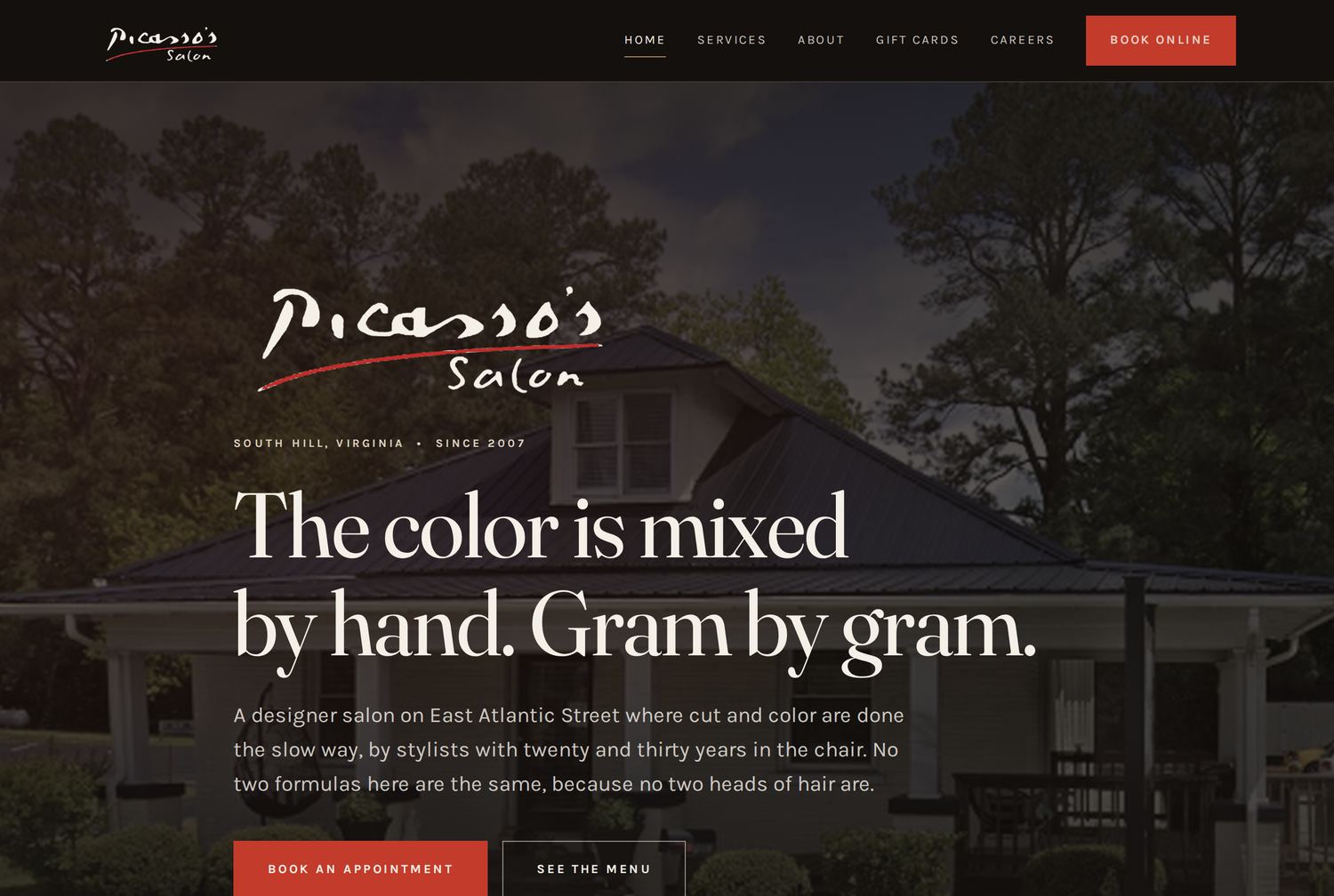
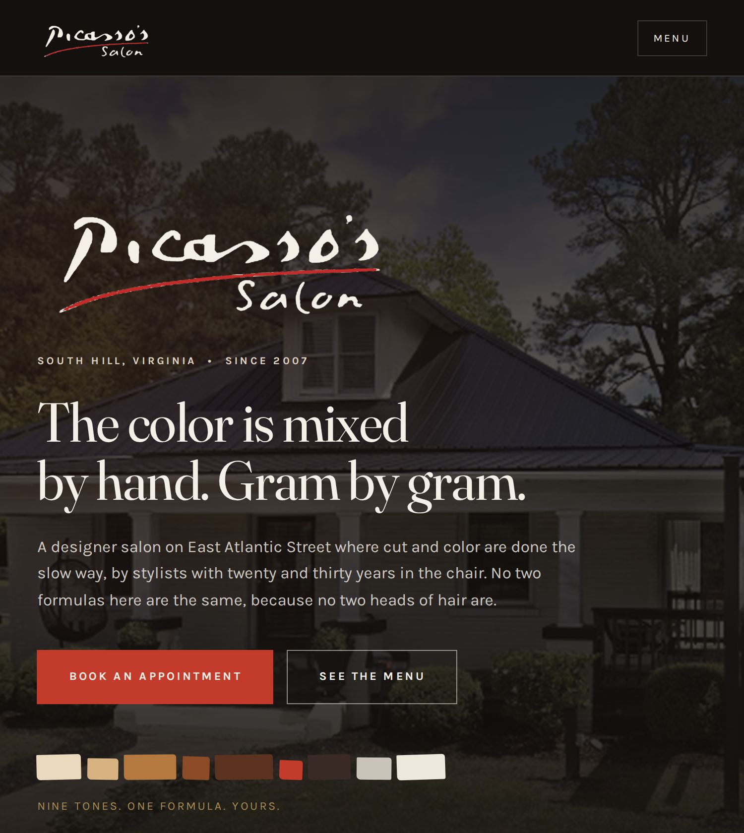
The Picasso's Salon home page hero with labelled regions
1
2
3
4
5
6
7
The reference site, first screen, every region named.
  1. Header. Logo left, nav right, one button in the accent color. Sticky, so it follows you down.
  2. Logo. Her real wordmark, recolored for a dark background.
  3. Eyebrow. The small label above a headline. Cheap to add, does a lot of work.
  4. Headline. What only this business could say. Not a greeting.
  5. Subhead. One sentence that earns the next scroll.
  6. CTA. The one thing you want them to do, plus a quieter second option.
  7. Signature element. The nine hand cut color chips. Exists on no other site.

Swipe to see all of it

HEADER logo and nav HERO headline, one sentence, one button 3 seconds the fold SECTION one idea SECTION one idea SECTION one idea FOOTER address, phone, hours, links
Almost every business site on earth is this stack in a slightly different order.

Go look

On the reference site, name every section on the home page from top to bottom without scrolling back up. There are eleven. Write the list.

Browser prompt: Label the anatomy of any page

Open any business website, then paste this into the Claude Chrome extension. It reads the page and reports back. It changes nothing. Keep every one of these, because by lesson ten they add up to a complete audit you can run on a prospect before you ever call them.

Paste into the Chrome extension

You are on a business website. Read only. Do not click anything, do not fill anything in, change nothing.

Report back:
1. Every region on the home page from top to bottom, in order, named as header, hero, section, or footer.
2. For each section, one sentence on what it is trying to get me to do or believe.
3. The exact headline text in the hero. Then say whether it tells me what this business does, why they are different, and what to do next. Name which of those three are missing.
4. What the first button on the page says, word for word.
5. How many different colors are used on buttons across the page.
6. How many different fonts you can identify.
7. Anything on the page that is trying to do two jobs at once.

Plain numbered list.

Read only. It will not click, submit, or sign in to anything.

Assignment

Start here

  1. Use the Google Maps method to pull one local business site.
  2. Then do the same exercise on Stripe or Apple and notice how many fewer sections there are.

All the places to look

  1. Screenshot one local business site from the Google Maps method below. Draw boxes on it, on paper or in any photo app, and label every region using the words above.
  2. Do the same for the reference site.
  3. Write one paragraph on the difference between the two heroes. Which one tells you what to do next, and how fast?
  4. Find one site where a section is trying to do two jobs. Write what you would split it into.

Check yourself

Someone says 'the thing at the top looks bad.' Can you now ask three specific questions back? If you can, you have the vocabulary.

Week 1  •  Wednesday  •  Lesson 3 of 10

Why some sites look expensive

Goal Learn the four levers that separate a professional site from a template.

Words you need

Typeface
The design of the letters. Also called a font, close enough.
Serif
Letters with little feet on the ends. Reads as traditional, established, expensive.
Sans serif
Letters with no feet. Reads as modern, clean, plain.
Type pairing
Using one typeface for headlines and a different one for body text. Two is right. Three is usually a mistake.
Hierarchy
Making the important thing obviously bigger, bolder or higher than the less important thing.
Contrast
The difference between two things. Dark text on a light background is high contrast. Grey text on a slightly lighter grey is a readability failure.
Accent color
The one bright color used for buttons and small marks. One. Not three.
Restraint
Choosing not to add the thing you could add. The hardest and most valuable skill in design.

The lesson

There are only four levers, and amateurs get all four wrong in the same direction: too many fonts, not enough space, too many colors, and everything the same size.

SPACE. If you make one change to any site and nothing else, double the empty space around everything. Cheap sites are crowded. Expensive sites are calm. Space signals confidence, because it says this business is not desperate to cram every fact in front of you.

TYPE. Pick two typefaces and use them everywhere. One for headlines with some character to it, one for body text that disappears while you read. Never leave the browser default, which is Times New Roman, and which instantly reads as unfinished.

COLOR. Four or five colors total. A dark, a light, one accent, and a muted tone or two. Pull them from something real: the client's logo, their building, their product. Colors invented out of nowhere look invented.

SIZE. Your headline should be dramatically bigger than your body text, not slightly bigger. Timid hierarchy is the most common tell of a beginner. If you cannot decide, go bigger.

See it

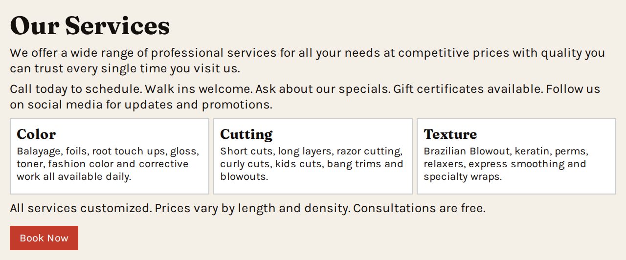
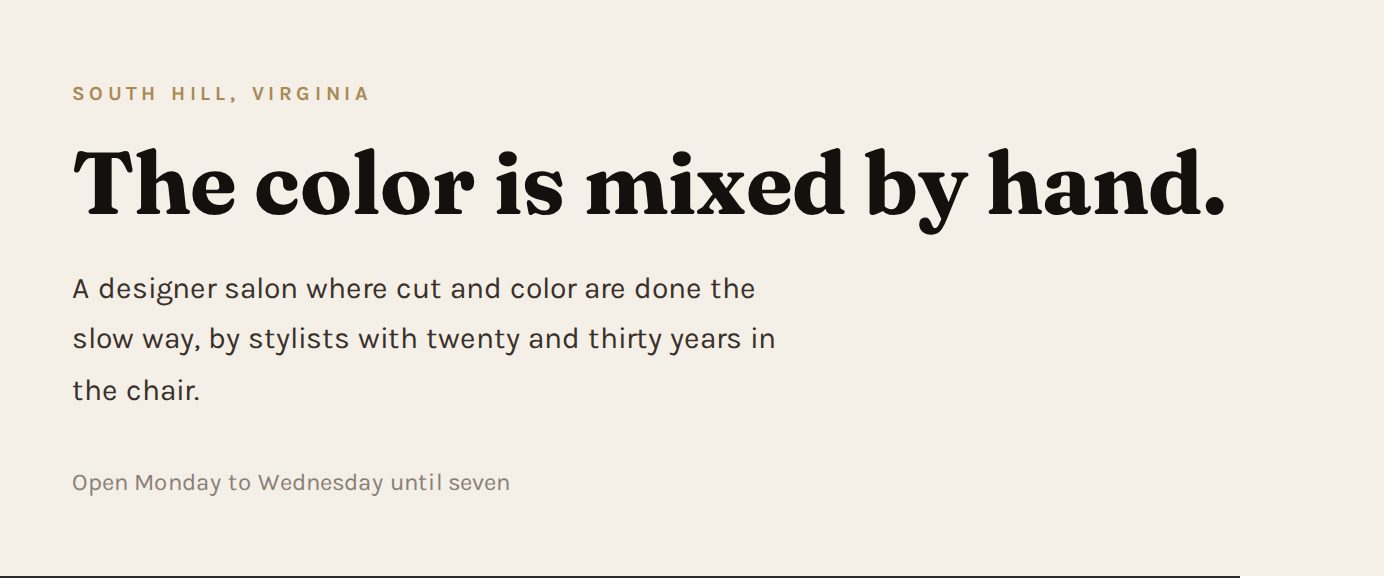
CrowdedTwo versions of a services section, one crowded and one with generous spacing
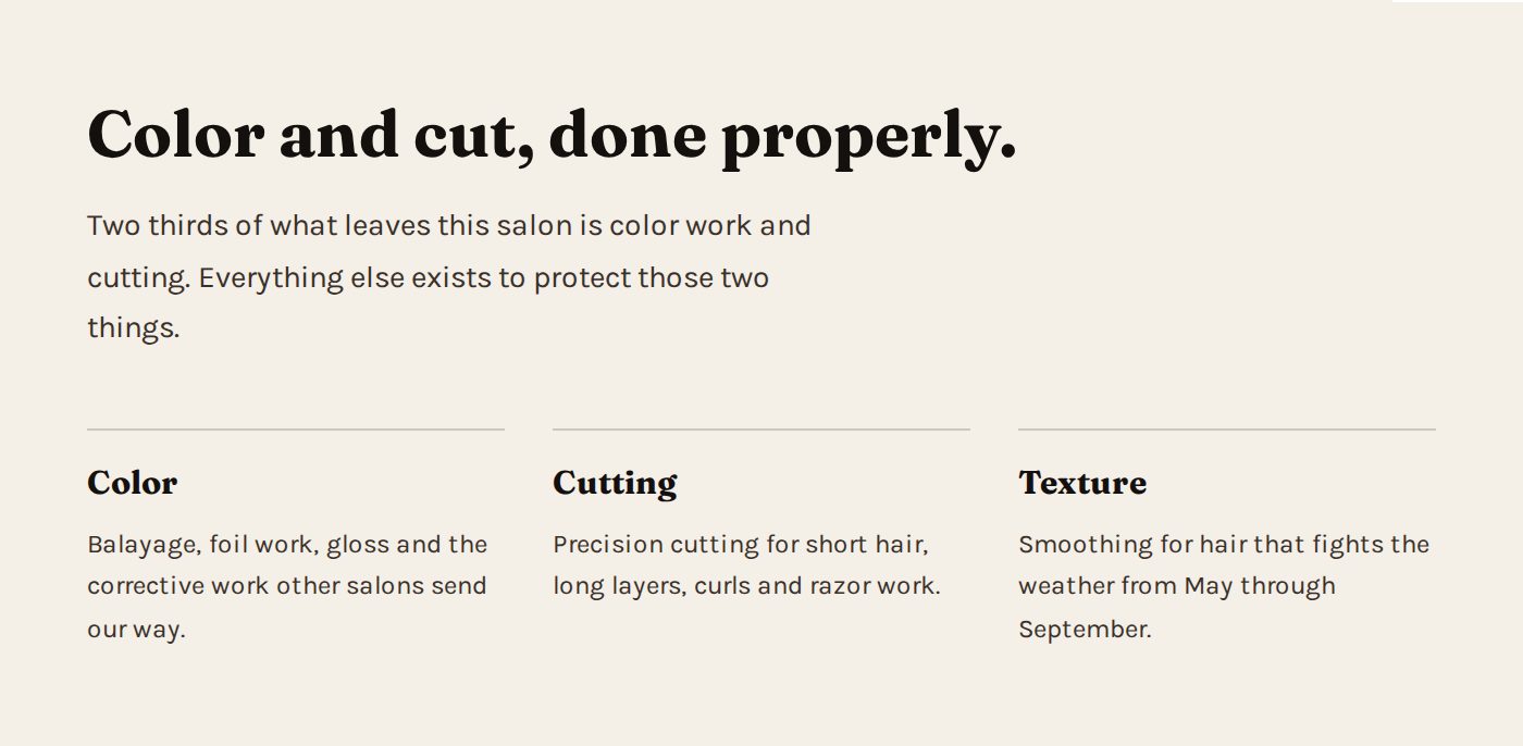
SpaciousTwo versions of a services section, one crowded and one with generous spacing
Lever one, space. Same three services, same information. The only thing that changed is how much room it was given.
Default and mixedTwo versions of a hero, one in mixed default fonts and one with a considered type pairing
Two typefaces, one systemTwo versions of a hero, one in mixed default fonts and one with a considered type pairing
Lever two, type. Left uses the browser default plus two more fonts. Right uses one display face and one body face.
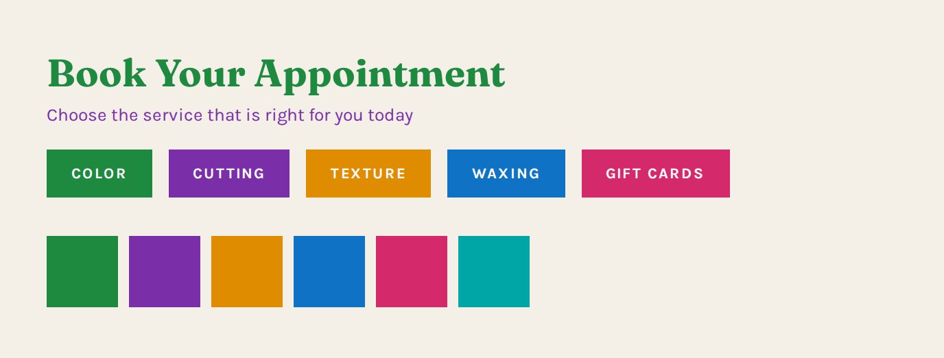
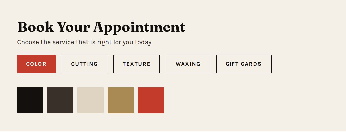
Six accentsTwo versions of a row of buttons, one rainbow coloured and one with a single accent colour
One accentTwo versions of a row of buttons, one rainbow coloured and one with a single accent colour
Lever three, color. Left gives every button its own color. Right gives the accent to the one button that matters and lets the rest stay quiet.
FlatTwo versions of the same five lines of text, one flat and one with strong size hierarchy
Real hierarchyTwo versions of the same five lines of text, one flat and one with strong size hierarchy
Lever four, size. Identical words both times. Left makes everything the same. Right decides what you read first.

Go look

On the reference site: the display typeface is Fraunces, the body is Karla. The palette is warm black, bone, one red, and a brass tone for small labels. The red appears only on buttons and small marks. Count how many times the red is used on the home page. It is fewer than you would guess.

Browser prompt: Score a site on the four levers

Open any business website, then paste this into the Claude Chrome extension. It reads the page and reports back. It changes nothing. Keep every one of these, because by lesson ten they add up to a complete audit you can run on a prospect before you ever call them.

Paste into the Chrome extension

You are on a business website. Read only. Change nothing.

Score this site out of ten on each of the four levers, and give one sentence of evidence for each score. Do not be polite, be accurate.

1. SPACE. Is it crowded or calm? Look at the gap between sections and the padding inside boxes.
2. TYPE. How many typefaces? Is any of it the browser default, meaning Times New Roman or unstyled Arial?
3. COLOR. How many colors are doing accent work? List them as hex codes if you can read them.
4. SIZE. Is the headline dramatically bigger than the body text, or only slightly bigger?

Then: name the single weakest lever, and write the one change that would improve this site the most. One sentence.

Read only. It will not click, submit, or sign in to anything.

Assignment

Start here

  1. Expensive: Awwwards, Godly, or One Page Love. Pick any three from the front page.
  2. Cheap: the Google Maps method. Search a trade plus a small town and open five listings.
  3. Deliberately plain: Berkshire Hathaway, Craigslist, McMaster Carr. Judge these out loud, they can take it.

All the places to look

  1. Open Awwwards, Godly or One Page Love and pick any three from the front page. For each, write the two typefaces if you can tell, name the accent color, and rate the space out of ten.
  2. Now use the Google Maps method to open five local business sites. Pick the three weakest. Write which of the four levers is most broken on each. Keep these opinions to yourself.
  3. Take the worst one and write a five line plan to fix it using only the four levers. No new content, no new photos.
  4. Open Berkshire Hathaway, Craigslist and McMaster Carr. Score each on the four levers, then answer one question about each: is this site actually failing its customer, or is it doing something you did not account for?
  5. Pull a palette: take a photo of any local business sign, and write down four colors from it that would work together on a website.

Check yourself

You should now be able to look at any site and say which of the four levers is the weakest, within about five seconds.

Week 1  •  Thursday  •  Lesson 4 of 10

Color, type and the idea of a system

Goal Stop picking things one at a time. Build a set of decisions and reuse them.

Words you need

Design system
A small set of decisions written down once and reused everywhere. Colors, type sizes, spacing steps, button styles.
Token
One named decision. For example: ink means this exact dark color. Everything on the site uses the name, so changing the name changes it everywhere at once.
Hex code
How a color is written in code. Six characters after a hash mark. #FF2D00 is the Ricochet red.
Scale
A ladder of sizes that relate to each other. Not random numbers, a set.
Consistency
The same thing looking the same way every time it appears. Buttons especially.
Signature element
One visual idea unique to this business that appears nowhere else on the internet.

The lesson

The moment you make color and size decisions one at a time, the site starts drifting. Three shades of almost the same grey. Buttons that are slightly different sizes on different pages. It looks wrong and nobody can say why.

The fix is a system. Decide once, at the top of the stylesheet: these are the five colors, this is the display font, this is the body font, these are the four text sizes, this is what a button looks like. Then never make those decisions again for the rest of the project.

The signature element is the part most people skip, and it is what separates a good site from a memorable one. It is one visual idea pulled from something true about the business. On the reference site it is a strip of nine hand cut color chips, each a slightly different width and angle. It exists because the salon mixes color by hand on a scale, gram by gram, and no competitor does. That strip is on the hero, the gift card and the footer. It could not be pasted onto any other salon's site without lying.

See it

Swipe to see all of it

TIMID, EVERYTHING ALMOST THE SAME Headline Body text Small label CONFIDENT, A REAL LADDER Headline Subhead Body text that disappears while you read it SMALL LABEL If you cannot decide how big the headline should be, go bigger. Timid hierarchy is the most common tell of a beginner. Four sizes is usually enough for a whole site. Pick them once, then stop deciding.
A type scale is a ladder, not a set of guesses.
A strip of nine hand cut colour chips in hair tones, slightly rotated
The signature element from the reference site. Nine chips, each a different width, each rotated slightly. It stands for color mixed by hand, gram by gram, which is the one thing that salon can say and its competitors cannot.

Go look

On the reference site, open css/site.css and look at the first twenty lines. Every color, font and spacing decision on the entire site is in that one block. That is a design system.

Browser prompt: Pull a site's design system

Open any business website, then paste this into the Claude Chrome extension. It reads the page and reports back. It changes nothing. Keep every one of these, because by lesson ten they add up to a complete audit you can run on a prospect before you ever call them.

Paste into the Chrome extension

You are on a business website. Read only. Change nothing.

Extract the design system actually in use, whether they meant to have one or not.

1. Every color used, as a hex code, with what each one is used for.
2. The typeface used for headings and the typeface used for body text, by name.
3. The pixel size of the largest heading, a subheading, and the body text.
4. What a primary button looks like: background color, text color, border, corner radius, padding.
5. Whether buttons look identical everywhere on the page, or whether they drift.
6. Any visual element that appears more than once and seems intentional.

Report as a plain list with the hex codes written out.

Read only. It will not click, submit, or sign in to anything.

Assignment

  1. Write a complete design system for a business you know. Five colors with hex codes, two typefaces, four text sizes, and what a button looks like. One page.
  2. Invent a signature element for that business. It must come from something true and specific about them, and you must be able to explain in one sentence why it could not belong to a competitor.
  3. Find a site with no signature element. Write what theirs could be.

Check yourself

If somebody asked you to change the accent color on your system, would it be one edit or forty? One is the answer you want.

Week 1  •  Friday  •  Lesson 5 of 10

Structure, flow and what each page is for

Goal Decide what pages exist and what order the sections go in, before designing anything.

Words you need

Sitemap
The list of pages and how they connect. Usually drawn as a box for each page.
Page job
The one thing a page exists to accomplish. Every page needs exactly one.
Flow
The order of sections, arranged so each one answers the question the last one raised.
Conversion
A visitor doing the thing you wanted. Booking, calling, filling the form.
Friction
Anything that makes doing that thing harder. Extra clicks, extra fields, unclear wording.
Landing page
A single page built for one purpose, usually one ad or one offer.

The lesson

Most small business sites need five or six pages, not twenty. Home, services with prices, about, contact or booking, and then one or two that match what the business actually needs. A salon needs gift cards and careers. A lawn care business needs neither and needs a service area map instead.

Section order is not decoration. Each section should answer the question the previous one just created in the visitor's head. What is this. Why should I believe you. What exactly do you do. What does it cost. Who are you. What do others say. How do I start. Put those in the wrong order and people leave in the middle.

Friction is where money leaks. A form with twelve fields gets fewer submissions than the same form with five. A phone number as the only way to act loses everybody who is browsing at eleven at night, which for most local businesses is a lot of people.

See it

Swipe to see all of it

HOME make them stay SERVICES answer the price ABOUT earn the trust BOOK the one thing GIFT CARDS take money now CAREERS fill the chair Five or six pages. Every one has a job written under its name. If you cannot write the job, the page should not exist.
Six pages, each with its job written underneath.

Swipe to see all of it

HERO what even is this PROOF STRIP why should I believe you WHAT WE DO is what I need on the list PRICES can I afford it THE WORK, THE PEOPLE are they any good BOOK how do I start THE QUESTION IN THEIR HEAD
Section order is not decoration. Each one answers the question the last one raised.

Go look

The reference site has six pages. Read the home page top to bottom and write the question each section is answering. Then check whether any section answers a question nobody asked yet.

Browser prompt: Map the pages and find the friction

Open any business website, then paste this into the Claude Chrome extension. It reads the page and reports back. It changes nothing. Keep every one of these, because by lesson ten they add up to a complete audit you can run on a prospect before you ever call them.

Paste into the Chrome extension

You are on a business website. Read only. Do not submit anything, do not sign in, change nothing.

1. List every page reachable from the navigation and the footer.
2. For each page, one sentence on what job it seems to exist to do.
3. Name any page that appears to have no job.
4. Name any job that has no page.
5. Starting from the home page, count the number of clicks required to actually give this business money or book time with them. Describe each click.
6. List every point of friction along that path: extra steps, unclear wording, required fields, dead ends.

Plain numbered list.

Read only. It will not click, submit, or sign in to anything.

Assignment

Start here

  1. Google Maps method, any trade, any small town near you.
  2. For a contrast, run the same click count on Stripe or Basecamp and compare the numbers.

All the places to look

  1. Draw the sitemap for a real local business. Boxes and arrows on paper is fine.
  2. For each page, write its one job in one sentence.
  3. For the home page, list the sections in order and write the question each one answers.
  4. Using the Google Maps method, open one local business site and list every point of friction between landing on it and giving them money. Count the clicks. Then count the same clicks on Stripe or Basecamp and compare.

Check yourself

End of week one. You should be able to walk into any small business site and produce a one page critique in fifteen minutes. That critique is a sales tool.

Week 2  •  Monday  •  Lesson 6 of 10

The client conversation

Goal Get everything you need out of a business owner who does not know what they want.

Words you need

Intake
The conversation where you collect everything before building anything.
Brief
One page written back to the client summarizing what you heard, which they approve before you start.
Scope
What is included and what is not. Written down, or it grows for free.
Scope creep
The client adding things after the price is set. Normal, and handled by writing scope down early.
Assets
The stuff you need from them. Logo file, photos, hours, prices, copy.
Revision round
One pass of changes. Two rounds included is standard. Unlimited rounds is how people lose money.

The lesson

Business owners cannot describe a website. They can describe their business, their customers and their frustrations. Ask about those instead and design from the answers.

The single most useful question is: what is the one thing you want somebody to do on this site. Most owners will try to say four things. Make them pick one. Everything on the site then either supports that one thing or gets cut.

The second most useful move is showing three reference sites and asking which feels closest. Pointing is easy, describing is hard. This one trick will save you hours of guessing.

Get assets before you build, not after. The build stalls at ninety percent waiting on photos more often than for any other reason. Ask for the logo as an actual file, not a screenshot, and ask what format they have.

Go look

Read the intake questions in the Picasso's recap. Thirteen questions, asked before a single line was written. Notice that none of them are about design.

Browser prompt: Research a business before you call them

Open any business website, then paste this into the Claude Chrome extension. It reads the page and reports back. It changes nothing. Keep every one of these, because by lesson ten they add up to a complete audit you can run on a prospect before you ever call them.

Paste into the Chrome extension

You are on a business website. Read only. Change nothing.

I am about to contact this business about building them a new website. Gather what I need.

1. Business name, address, phone number, and email exactly as published.
2. Owner or manager name if it appears anywhere.
3. Hours as published on this site.
4. Every service or product they list.
5. Any social media links, and where they point.
6. Anything on the site that looks out of date: an old copyright year, a past event, a season that has passed, prices that look old.
7. The three things about this site I could most credibly offer to fix.

Plain numbered list. Do not editorialize beyond item seven.

Read only. It will not click, submit, or sign in to anything.

Assignment

  1. Write your own intake list. Ten to fifteen questions, in your words. Print it.
  2. Interview a real business owner. A parent, a neighbor, anybody with a business. Use your list. Take notes.
  3. Write the one page brief back to them and get them to say yes or correct you.
  4. Write a scope: how many pages, how many revision rounds, what is not included.

Check yourself

Did you get through the interview without saying 'so what do you want it to look like?' If you did, the list works.

Week 2  •  Tuesday  •  Lesson 7 of 10

Directing the AI

Goal Get good output on the first or second try instead of the ninth.

Words you need

Prompt
What you ask for. The quality of the output is mostly set here.
Iteration
Going back and forth. Normal and expected. The goal is fewer, better rounds.
Specificity
The difference between 'make it nicer' and 'increase the space above the headline and make the headline about twice as big.'
Reference
An existing site you point at and say: like this, but for a plumber.
Hallucination
When AI confidently produces something false. A made up review, a wrong phone number, a fake statistic.
Review pass
Reading the output critically before showing anybody. Never skip this.

The lesson

Vague requests get generic output, every time. 'Build me a website for a salon' gets you the same site everybody else gets. The fix is to hand over the brief you already wrote in lesson six, plus the design system from lesson four, plus one reference site.

When something comes back wrong, do not say make it better. Name the region using the vocabulary from lesson two, name the lever from lesson three, and say which direction. 'The hero is crowded, double the space above and below the headline and cut the paragraph to two lines.' That gets fixed in one round.

Never trust content you did not supply. AI will happily produce a testimonial that no customer ever said, a statistic nobody measured, and a phone number that is close but wrong. Every price, every hour, every name, every quote on a client site has to trace back to the client. This is the difference between a professional and somebody who is going to embarrass a client.

Ask for the whole file every time. Snippets to paste into the middle of existing code is how things break.

See it

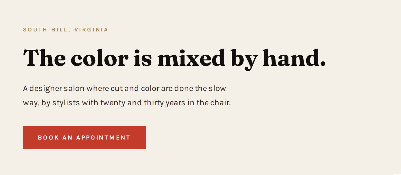
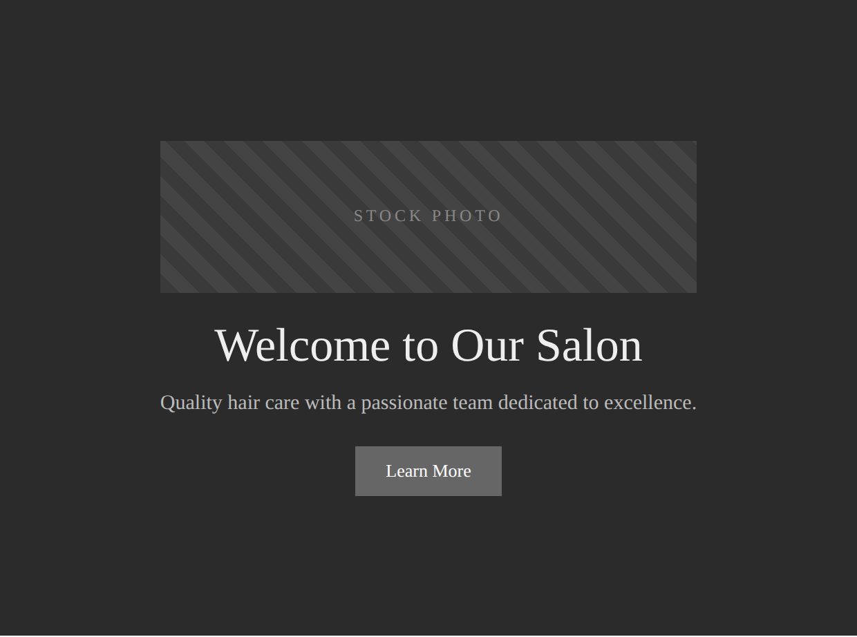
Vague promptTwo hero sections, one generic with a stock photo placeholder and one specific to the real salon
Specific promptTwo hero sections, one generic with a stock photo placeholder and one specific to the real salon
Left is what build me a website for a salon produces. Right is what the brief plus the design system plus one reference site produces. Same request. Different amount of thinking done up front.

Go look

Look at any headline on the reference site and ask yourself what prompt would have produced it. The answer is not 'write a headline.' It is a brief containing the fact that the salon weighs its color on a scale.

Browser prompt: Check whether a claim on a page is real

Open any business website, then paste this into the Claude Chrome extension. It reads the page and reports back. It changes nothing. Keep every one of these, because by lesson ten they add up to a complete audit you can run on a prospect before you ever call them.

Paste into the Chrome extension

You are on a web page. Read only. Change nothing.

I need to know whether the content on this page is verifiable before I put anything like it on a client site.

1. List every specific claim on this page: numbers, statistics, awards, certifications, years in business, customer counts.
2. For each one, say whether the page provides any source, link, or evidence.
3. List every testimonial or review quote, and say whether a real name, photo, or link to the original is attached.
4. Flag anything that reads as though it could have been generated rather than collected.

Plain numbered list. Do not guess at whether a claim is true, only report whether it is supported.

Read only. It will not click, submit, or sign in to anything.

Assignment

  1. Take the brief from lesson six and turn it into one long, specific build prompt. Include the design system, the sitemap, the page jobs and one reference site.
  2. Run it. Look at what comes back.
  3. Write five pieces of feedback using the vocabulary. Each one names the region, the lever and the direction. No feedback longer than one sentence.
  4. Run those. Compare round one to round two and write what improved.

Check yourself

Could somebody else read your build prompt and know exactly what to make? If not, it is not specific enough yet.

Week 2  •  Wednesday  •  Lesson 8 of 10

Words and pictures

Goal Fill the site with content that could not have come from a template.

Words you need

Copy
The words on the site. Somebody has to write them and it is usually you.
Headline
The biggest sentence on the page. It should say something only this business could say.
Generic copy
Words that would be equally true for any competitor. Quality service, passionate team, customer focused. Delete on sight.
Alt text
A written description attached to every image, for people using screen readers and for search engines. Never leave it empty.
Resolution
How many pixels an image has. Too few looks blurry. Too many makes the page slow.
Compression
Shrinking image files so pages load fast. Photos should almost never be over about 300 kilobytes.
Stock photo
A purchased generic photo of strangers. Instantly recognizable and instantly damaging to trust.

The lesson

Here is the test for every sentence on a client site: could their closest competitor put this exact sentence on their site without lying? If yes, cut it. Quality service and passionate team pass that test for everybody, which is why they mean nothing.

Good copy comes from the intake. Something the owner said in passing, usually in a sentence they did not think was important, is almost always the headline. Listen for the thing they do that they assume everybody does.

Photos are usually the hardest part and the most valuable. A real photo of the real place beats a beautiful stock photo every single time, even if the real one is slightly worse. People can tell. A phone camera on a bright morning, shooting toward a window, gets you most of the way there.

Alt text is not optional. Every image gets a real description of what is in it. Blind visitors use it, and search engines read it, which means an empty alt attribute is a gallery of work that no search engine can see.

See it

Swipe to see all of it

EMPTY alt="" Search engine sees: nothing Screen reader says: nothing Your best work: invisible WRITTEN alt="Blonde balayage with a soft root melt" Search engine sees: balayage Screen reader says: the picture Your best work: findable The old salon site had seventeen photos of real work and seventeen empty alt attributes.
Empty alt text makes your best work invisible to half the internet.
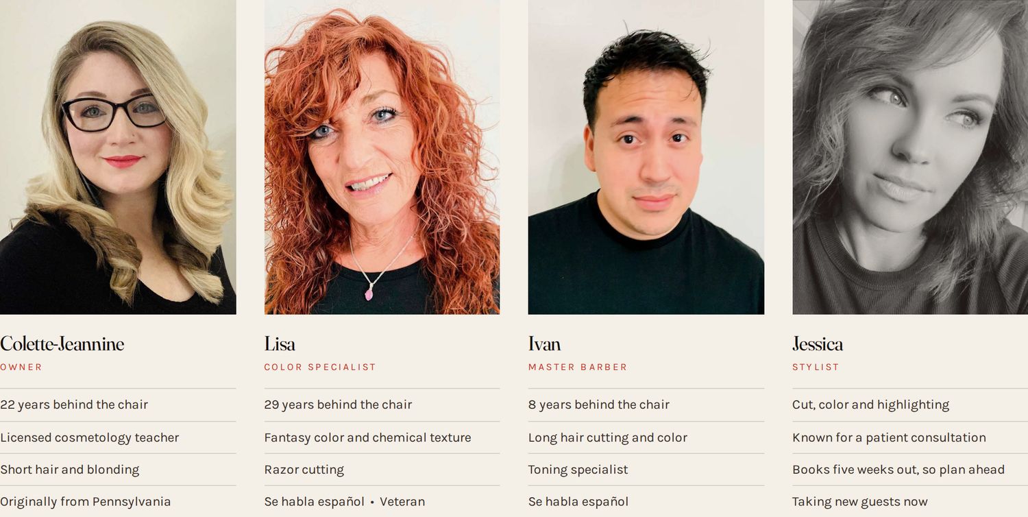
Four stylist portraits in a row on the Picasso's Salon team section
Four real people who actually work there, shot as they are. Three came off the salon's own site, one came from a phone. Compare that to a row of smiling strangers from a stock library and ask yourself which one a customer in a small town believes.

Go look

The reference headline is 'The color is mixed by hand. Gram by gram.' No competitor within a hundred miles can say that. It came from one sentence buried in the salon's old copy that nobody had noticed.

Browser prompt: Audit the words and pictures

Open any business website, then paste this into the Claude Chrome extension. It reads the page and reports back. It changes nothing. Keep every one of these, because by lesson ten they add up to a complete audit you can run on a prospect before you ever call them.

Paste into the Chrome extension

You are on a business website. Read only. Change nothing.

WORDS
1. Quote the main headline exactly.
2. For each of the first five sentences of body copy, say whether a direct competitor could put that same sentence on their own site without lying. Answer yes or no for each.
3. List every phrase that appears on thousands of other sites: quality service, passionate team, customer focused, and anything like them.

PICTURES
4. How many images are on the page.
5. For each image, report the alt text exactly, or say EMPTY if there is none.
6. Say whether each image looks like a real photo of this actual business or a stock photo of strangers, and how you can tell.
7. Report the file size of the three largest images if you can see it.

Plain numbered list.

Read only. It will not click, submit, or sign in to anything.

Assignment

Start here

  1. Stock photos are easiest to spot on template built sites. Google a trade plus a town and open the fourth or fifth result rather than the first.
  2. For the opposite, look at Apple or any restaurant site that shot its own food.

All the places to look

  1. Write the headline and the sentence under it for your client. Apply the competitor test. Rewrite until it passes.
  2. Go take fifteen photos of the real business with a phone. Outside, inside, the people, the work, the details.
  3. Pick eight, compress them, and write real alt text for each one.
  4. Open three sites from the Google Maps method that use stock photos of strangers, and write what they should have shot instead.

Check yourself

Read your headline to somebody who does not know the business. Can they tell you what makes that business different? That is the whole test.

Week 2  •  Thursday  •  Lesson 9 of 10

Phones, and people who are not you

Goal Make it work for everybody, on the device most people will actually use.

Words you need

Responsive
A site that rearranges itself to fit whatever screen it is on.
Breakpoint
The screen width where the layout changes. Usually one around 900 pixels and one around 600.
Viewport
The visible area of the screen. Also the tag in your HTML that tells phones how to size the page.
Horizontal scroll
When a page can be dragged sideways on a phone. Always a bug. Always.
Tap target
Anything meant to be tapped. Needs to be big enough for a thumb, roughly 44 pixels.
Accessibility
Making the site usable by people with poor vision, no vision, or who cannot use a mouse. Often shortened to a11y.
Contrast ratio
A measurement of how readable text is against its background. Light grey on white fails.
Screen reader
Software that reads a page out loud. It depends entirely on your headings and your alt text being right.

The lesson

More than half of the visitors to a local business site are on a phone, and for a salon or a restaurant it is closer to three quarters. A site that was only ever checked on a laptop is a site that was never really checked.

The most common phone bug is sideways scroll, caused by one element that is wider than the screen. It makes a site feel broken instantly. Test by opening the site on an actual phone and trying to drag the page left and right. If it moves, something is too wide.

Headings are structure, not decoration. One H1 per page, then H2 for each section, then H3 inside those. Never pick a heading level because of its size. Pick the right level and then style it. Screen readers navigate a page by jumping between headings, so wrong levels make a site unusable for somebody who is blind.

Grey text on a light background is the most common accessibility failure and it is entirely a fashion choice. If you cannot read it comfortably in daylight on a phone, it fails.

See it

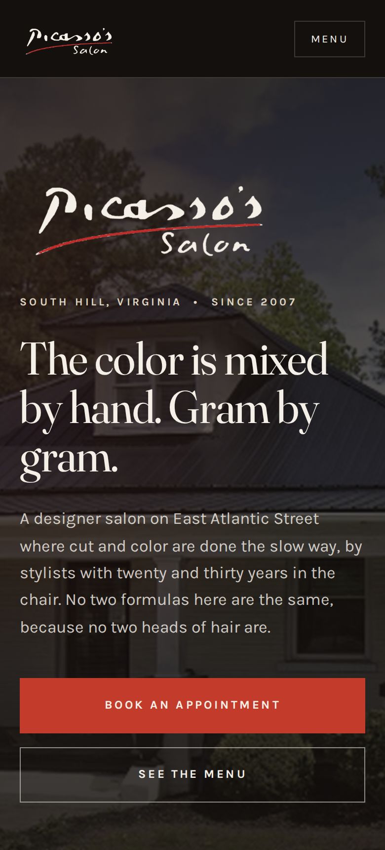
1280px, laptopThe same home page shown at laptop, tablet and phone widths
768px, tabletThe same home page shown at laptop, tablet and phone widths
390px, phoneThe same home page shown at laptop, tablet and phone widths
One site, three widths. Nothing was rebuilt. The layout rearranges itself at two breakpoints.

Swipe to see all of it

BROKEN too wide one element sticks out the whole page now drags sideways FIXED Test: open it on a phone and try to drag the page left and right. If it moves, something is too wide.
The most common phone bug, and how to catch it in four seconds.

Swipe to see all of it

H1 one per page, the page title H2a section H3something inside that section H2the next section H2the section after that THE RULE Never pick a heading level because of how big it looks. Pick the level that is structurally true, then style it however you want. A blind visitor jumps through a page heading by heading. Wrong levels turn that into a maze. The old salon site had zero H2 headings.
Heading levels are structure. Style them however you like afterward.

Swipe to see all of it

Light grey oncream 1.4 : 1 FAILS Dark grey onnear black 1.9 : 1 FAILS Near black oncream 15.8 : 1 PASSES White onthe red 4.6 : 1 PASSES The bar is 4.5 to 1 for normal text. Grey on grey is a fashion choice that costs you readers.
Four combinations. Two of them lose readers.

Go look

Open the reference site on a phone. Try to drag it sideways. It will not move. Tap the Menu button. Then open the careers page and try tapping the upload boxes with a thumb.

Browser prompt: Test a site on a phone

Open any business website, then paste this into the Claude Chrome extension. It reads the page and reports back. It changes nothing. Keep every one of these, because by lesson ten they add up to a complete audit you can run on a prospect before you ever call them.

Paste into the Chrome extension

You are on a business website. Read only. Change nothing.

Resize the browser window to 390 pixels wide, the width of a normal phone, and answer from that view.

1. Can the page be dragged sideways at all? If yes, name the element that is too wide.
2. Does the navigation collapse into a menu button, and does that button work?
3. Is any text too small to read comfortably?
4. Are any buttons or links too close together or too small to hit with a thumb?
5. Does any image overflow, stretch, or get cut off?
6. How many headings are on the page, and what level is each one? Report whether there is exactly one H1.
7. Name any text where the color is too close to the background to read easily.

Plain numbered list. Then say in one sentence whether this site was ever really tested on a phone.

Read only. It will not click, submit, or sign in to anything.

Assignment

Start here

  1. Test the four study sites on your phone first, so you know what right feels like.
  2. Then test three from the Google Maps method and watch how fast the difference shows up.

All the places to look

  1. Open your build on a real phone. Write down every single thing that is wrong. There will be more than you expect.
  2. Try to drag every page sideways. Fix anything that moves.
  3. Check every tap target with your thumb, not your finger tip.
  4. Turn on the screen reader on a phone and try to use your own site with your eyes closed for two minutes. Write what you learned.
  5. Fix everything on the list.

Check yourself

Hand your phone to somebody who has never seen the site and say nothing. Watch where they get stuck. Do not help them.

Week 2  •  Friday  •  Lesson 10 of 10

Launch, search, and getting paid

Goal Put it live, make it findable, hand it over, and charge for it.

Words you need

SEO
Search engine optimization. Everything you do so the site shows up when somebody searches.
Title tag
The sentence that shows up as the blue link in search results. Every page needs its own, with the town in it.
Meta description
The grey sentence under the blue link. You write it, or the search engine picks a random one.
Structured data
Hidden code telling search engines the address, hours, phone and services in a format they read exactly. This is how a business shows up in the map box.
Sitemap
A file listing every page, so search engines can find them all.
Google Business Profile
The free listing that appears in maps. For a local business this is often worth more than the website.
Staging
A live URL used for showing and approving, before the real domain points at it.
Handoff
Giving the client everything: the files, the logins, and a written list of what is real and what is not.

The lesson

Deploying is the easy part. Drag the folder onto a host and it is live in under a minute, on a free address that looks like yourbusiness.netlify.app. That address is staging. It is for showing the client, not for the world.

Pointing the real domain at it is the moment it goes live for real, and that is the one step you never take without the owner explicitly saying go. It is reversible, but a business losing its website for an afternoon is a real problem for them.

SEO for a local business is unglamorous and mostly mechanical: a title tag with the town in it on every page, a written description on every page, alt text on every image, structured data with the address and hours, a sitemap, and the names of the surrounding towns people drive in from. Do those and you are ahead of most small business sites in the country.

Be honest about what a website will and will not do. For a lot of local businesses, a claimed Google listing and a working booking link move more money than a redesign. Say that out loud even though it makes the redesign sound less important. Clients remember who told them the truth.

Handoff is not sending a link. It is a written list of what is real, what is placeholder, what still needs wiring, and who holds which login. Without that, you get a phone call in four months about something you assumed they knew.

See it

Swipe to see all of it

picassossalonsouthhill.com › services Services and Prices | Picasso’s Salon South Hill VA Full service menu and starting prices in South Hill, Virginia. Balayage, foil highlights, corrective color, precision cutting. THE URL THE TITLE TAG THE META DESCRIPTION clean, no file extension you write this. town goes in it you write this too, or Google grabs a random sentence Three pieces of text. You control all three. Most small business sites control none of them. The old salon site had one title that said Home, and a description cut off in the middle of a sentence.
A search result is three pieces of text you control.

Swipe to see all of it

YOUR FOLDER on your computer THE HOST drag and drop, 40 seconds STAGING URL name.netlify.app show the client here REAL DOMAIN ONLY ON GO The last arrow is the only irreversible feeling one. Never take it without the owner saying go.
Deploying is easy. The last arrow is the one that needs permission.

Go look

The reference site is deployed but the client's real domain still points at the old site. That is staging, on purpose, because the prices on it are placeholders until the owner reviews them.

Browser prompt: Audit a site's search setup

Open any business website, then paste this into the Claude Chrome extension. It reads the page and reports back. It changes nothing. Keep every one of these, because by lesson ten they add up to a complete audit you can run on a prospect before you ever call them.

Paste into the Chrome extension

You are on a business website. Read only. Change nothing.

1. The page title exactly as it appears in the browser tab. Say whether it contains the town or city.
2. The meta description if there is one, exactly. Say whether it looks written or auto generated.
3. Whether the page has structured data, meaning a script of type application slash ld plus json. If yes, say what type it declares.
4. Whether the site has a sitemap. Try adding slash sitemap dot xml to the address and report what happens.
5. Whether the site has a robots file. Try adding slash robots dot txt and report what it contains.
6. Every town or city name mentioned anywhere on the page.
7. Whether the address, phone number and hours appear as real text rather than inside an image.

Plain numbered list. Then name the single biggest search problem on this site.

Read only. It will not click, submit, or sign in to anything.

Assignment

  1. Deploy your build. Test every page and every image on the live URL, not on your computer.
  2. Write a title tag and a description for every page, with the town in each one.
  3. Write the handoff document: what is real, what is placeholder, what needs wiring, who holds what.
  4. Write your price. What do you charge for this, what is included, how many revision rounds, and what costs extra. Say the number out loud to somebody before you send it.
  5. Send the staging link to the owner and ask for their corrections.

Check yourself

Final project. A complete, live, real site for a real business, with a handoff document and a price. That is the deliverable for the whole course.

Reference

Every word in the course

When a client or a contractor uses one of these on you, you will know exactly what they mean.

Above and below
Hierarchy. What your eye hits first, second, third. You control this with size, weight, color and space.
Above the fold
Everything visible before scrolling. The phrase comes from newspapers, which were folded in half on the stand.
Accent color
The one bright color used for buttons and small marks. One. Not three.
Accessibility
Making the site usable by people with poor vision, no vision, or who cannot use a mouse. Often shortened to a11y.
Alt text
A written description attached to every image, for people using screen readers and for search engines. Never leave it empty.
Assets
The stuff you need from them. Logo file, photos, hours, prices, copy.
Breakpoint
The screen width where the layout changes. Usually one around 900 pixels and one around 600.
Brief
One page written back to the client summarizing what you heard, which they approve before you start.
Browser
Chrome, Safari, Firefox. It downloads those three kinds of file and draws the page on screen.
Card
A small rectangle holding one item: one service, one person, one product. Cards usually come in rows of two, three or four.
Compression
Shrinking image files so pages load fast. Photos should almost never be over about 300 kilobytes.
Consistency
The same thing looking the same way every time it appears. Buttons especially.
Contrast
The difference between two things. Dark text on a light background is high contrast. Grey text on a slightly lighter grey is a readability failure.
Contrast ratio
A measurement of how readable text is against its background. Light grey on white fails.
Conversion
A visitor doing the thing you wanted. Booking, calling, filling the form.
Copy
The words on the site. Somebody has to write them and it is usually you.
CSS
The file that holds every decision about how it looks. Colors, sizes, spacing, layout. Think of it as the skin and clothes.
CTA
Call to action. The thing you want them to do, written as a command. Book an appointment. Get a quote.
Deploy
Copying your folder onto the host so the world can see it. Also called shipping or publishing.
Design system
A small set of decisions written down once and reused everywhere. Colors, type sizes, spacing steps, button styles.
DNS
The phone book that connects the domain to the host. Changing DNS is how a domain starts pointing at a new site.
Domain
The name people type. picassossalonsouthhill.com. You rent it, usually about fifteen dollars a year. You never own it forever.
Favicon
The tiny icon in the browser tab. Missing one makes a site feel unfinished.
Flow
The order of sections, arranged so each one answers the question the last one raised.
Footer
The block at the very bottom. Address, phone, hours, links, copyright.
Form handler
The service that catches a form submission and emails it to somebody. A form without one sends nothing.
Friction
Anything that makes doing that thing harder. Extra clicks, extra fields, unclear wording.
Generic copy
Words that would be equally true for any competitor. Quality service, passionate team, customer focused. Delete on sight.
Google Business Profile
The free listing that appears in maps. For a local business this is often worth more than the website.
Grid
The invisible column structure everything lines up to. Good sites line up. Bad sites almost line up.
Hallucination
When AI confidently produces something false. A made up review, a wrong phone number, a fake statistic.
Handoff
Giving the client everything: the files, the logins, and a written list of what is real and what is not.
Header
The strip at the very top holding the logo and the nav. Sticky header means it stays put while you scroll.
Headline
The biggest sentence on the page. It should say something only this business could say.
Hero
The first full screen a visitor sees. Usually a big image or color, a headline, a sentence, and a button. It has one job: make somebody stay.
Hex code
How a color is written in code. Six characters after a hash mark. #FF2D00 is the Ricochet red.
Hierarchy
Making the important thing obviously bigger, bolder or higher than the less important thing.
Horizontal scroll
When a page can be dragged sideways on a phone. Always a bug. Always.
Host
The computer somewhere in the world that holds your files and hands them out when somebody asks. Netlify is a host.
HTML
The file that holds the words and the structure. Headings, paragraphs, images, links. Think of it as the skeleton.
Intake
The conversation where you collect everything before building anything.
Iteration
Going back and forth. Normal and expected. The goal is fewer, better rounds.
JavaScript
The file that makes things happen when you click. Menus opening, forms responding. Think of it as the muscles.
Landing page
A single page built for one purpose, usually one ad or one offer.
Lazy loading
Only downloading images when the visitor scrolls near them, so the page opens faster.
Meta description
The grey sentence under the blue link. You write it, or the search engine picks a random one.
Mockup
A visual of the finished design, not yet working.
Nav
Short for navigation. The row of links across the top that goes to the other pages.
Page job
The one thing a page exists to accomplish. Every page needs exactly one.
Prompt
What you ask for. The quality of the output is mostly set here.
Prototype
Something clickable that looks real but is not wired up.
Redirect
A rule sending anybody who visits one address to a different one.
Reference
An existing site you point at and say: like this, but for a plumber.
Repo
Short for repository. A folder of code with a full history of every change.
Resolution
How many pixels an image has. Too few looks blurry. Too many makes the page slow.
Responsive
A site that rearranges itself to fit whatever screen it is on.
Restraint
Choosing not to add the thing you could add. The hardest and most valuable skill in design.
Review pass
Reading the output critically before showing anybody. Never skip this.
Revision round
One pass of changes. Two rounds included is standard. Unlimited rounds is how people lose money.
Sans serif
Letters with no feet. Reads as modern, clean, plain.
Scale
A ladder of sizes that relate to each other. Not random numbers, a set.
Scope
What is included and what is not. Written down, or it grows for free.
Scope creep
The client adding things after the price is set. Normal, and handled by writing scope down early.
Screen reader
Software that reads a page out loud. It depends entirely on your headings and your alt text being right.
Section
One horizontal band of the page with one idea in it. A page is a stack of sections.
SEO
Search engine optimization. Everything you do so the site shows up when somebody searches.
Serif
Letters with little feet on the ends. Reads as traditional, established, expensive.
Signature element
One visual idea unique to this business that appears nowhere else on the internet.
Sitemap
The list of pages and how they connect. Usually drawn as a box for each page.
Specificity
The difference between 'make it nicer' and 'increase the space above the headline and make the headline about twice as big.'
SSL and HTTPS
The padlock in the address bar. Free on modern hosts, and browsers warn visitors without it.
Staging
A live URL used for showing and approving, before the real domain points at it.
Stock photo
A purchased generic photo of strangers. Instantly recognizable and instantly damaging to trust.
Structured data
Hidden code telling search engines the address, hours, phone and services in a format they read exactly. This is how a business shows up in the map box.
Tap target
Anything meant to be tapped. Needs to be big enough for a thumb, roughly 44 pixels.
Title tag
The sentence that shows up as the blue link in search results. Every page needs its own, with the town in it.
Token
One named decision. For example: ink means this exact dark color. Everything on the site uses the name, so changing the name changes it everywhere at once.
Type pairing
Using one typeface for headlines and a different one for body text. Two is right. Three is usually a mistake.
Typeface
The design of the letters. Also called a font, close enough.
Version
A saved state you can go back to. The reason a bad deploy is not a disaster.
Viewport
The visible area of the screen. Also the tag in your HTML that tells phones how to size the page.
Whitespace
Empty space. It is not wasted. It is the single biggest difference between an expensive looking site and a cheap one.
Wireframe
A rough grey box sketch of a layout, with no color or real content.